
You're probably staring at a familiar problem. You have something useful to say, but the draft feels flat. It might be a product page, a lesson, a campaign, a pitch deck, or a social post. The facts are there, yet people skim past it.
Then you watch a short video that tells the same idea through a face, a setting, a sequence of moments, and a clear emotional shift. You understand it faster. You remember it longer. You feel something.
That gap is where visual storytelling lives.
For creators, marketers, educators, and small business owners, this isn't a trend to admire from a distance. It's a practical skill that changes how people pay attention, process information, and decide what to do next. If you've been asking what is visual storytelling, the short answer is simple: it's the craft of using images, video, graphics, colour, pacing, and narrative structure to help people understand and care.
The better answer takes a bit more work. Good visual storytelling isn't just “adding visuals”. It's choosing the right visual moment, in the right order, with the right meaning. That's what turns content into communication.
What Is Visual Storytelling and Why It Matters Now
Visual storytelling is the use of visual media to communicate a story, idea, or message in a way that creates meaning and emotional connection. That visual media might be a short-form video, a photo sequence, an infographic, a slide, an animation, or a data chart. The format can change. The principle doesn't.
A plain definition helps, but it's easier to understand through contrast. A block of text might explain that a bakery uses family recipes and local ingredients. A 20-second video can show flour on a worktop, a baker shaping dough at dawn, a handwritten recipe card, and a regular customer smiling at the first bite. Same message. Different impact.
That difference matters more than ever. Visual storytelling has emerged as the most in-demand marketing skill in the UK, according to LinkedIn data reported by Marketing Week on the rise of visual storytelling in marketing. The same piece notes a broader behaviour shift: 80% of people will watch a video but only 20% will read text on a page.
Why people respond to visuals faster
Human attention is busy, not broken. People don't reject information. They reject friction.
Visual storytelling reduces that friction because it helps viewers grasp three things quickly:
- What this is about. A strong opening image gives the subject away instantly.
- Why it matters. Visual tension shows a problem, change, or outcome.
- What to feel or do next. The story guides attention towards a conclusion.
Practical rule: If your audience has to work hard to decode the message, the story is already losing power.
What visual storytelling is not
People often confuse visual storytelling with decoration. They're not the same.
| Approach | What it looks like | Result |
|---|---|---|
| Using visuals | Adding a stock image to a blog post | Some surface-level appeal |
| Visual storytelling | Building a sequence where each visual reveals meaning | Clearer understanding and stronger recall |
A chart with no point isn't a story. A video montage with no narrative isn't a story either. A story needs movement. Something changes, becomes clearer, or gains consequence.
That's why this skill matters now. Audiences don't just want more content. They want content that helps them feel oriented quickly. The creators who can do that with visuals have an advantage.
The Business Case for Visual Storytelling
Creative teams often understand the appeal of storytelling before leadership does. Decision-makers usually ask a harder question: does this improve business outcomes?
The answer is yes, when visuals are tied to a clear narrative. Storytelling strategies that incorporate visual elements help improve conversion rates by approximately 30%, according to storytelling statistics compiled by Marketing LTB. The same source notes that storytelling marketing in the UK grew by 46% in 2024, and that the market for storytelling-related initiatives is projected to grow from USD 185.5 million between 2021 and 2026.

Why stories convert better than explanations alone
People rarely act because they received more information. They act because the information became meaningful.
A visual story helps that happen by combining:
- Recognition. The viewer sees a situation that feels familiar.
- Emotion. The content creates tension, relief, trust, aspiration, or urgency.
- Clarity. The message lands without forcing the viewer to assemble the pieces alone.
- Momentum. The sequence moves towards a conclusion, which makes action feel natural.
Take a landing page as an example. A headline can tell visitors what a product does. A short visual story can show the before, the friction, and the after. That's often the difference between “interesting” and “I get it”.
Where the commercial value shows up
Visual storytelling tends to influence business results in a few practical areas:
-
Conversion-focused pages
Product pages, landing pages, and sign-up flows work better when the visuals don't just decorate the page but explain the value through a sequence. -
Brand memory
People remember scenes, contrasts, and moments better than abstract claims. -
Sales enablement
Teams close deals faster when they can show a transformation rather than describe one in generic language. -
Content efficiency
One strong narrative can be adapted into a video, slide deck, social cutdown, email asset, or infographic.
A good place to think through that wider system is this guide to a video content marketing strategy for modern teams.
Strong visual storytelling earns attention first, then turns that attention into understanding. That's what makes it commercially useful.
A simple business example
A tutor advertising GCSE revision could list subjects, lesson times, and testimonials. That's service information.
A stronger visual story would show a nervous student facing messy notes, a calm study session with a clear plan, then the student walking out of an exam room looking relieved. The offer hasn't changed. The meaning has.
That's the business case in plain language. Visual storytelling helps people see themselves in the outcome.
Unpacking the Core Components of a Visual Story
Most weak visual content fails for one reason. It tries to say too many things at once.
A better approach is to use a framework. One of the most useful is the Five C's from data storytelling: Clarity, Context, Consistency, Comparison, and Colour. Databricks discusses this framework in its guide to what data storytelling is and how the Five C's work, including the insight that titling graphs with the primary takeaway rather than a generic description improves memory retention of the key point.
That principle doesn't only apply to dashboards. It applies to almost every visual story you make.

Clarity and Context
Clarity means the viewer can understand the main idea quickly. If you're making a reel about handmade ceramics, don't open with five product angles, three text overlays, and a vague caption. Open with the potter's hands shaping the clay. Let the subject be obvious.
Context answers the question, “What am I looking at, and why should I care?” In a business chart, context might be labels and annotations. In a short video, it might be the setting, the problem, or the emotional cue that gives the scene meaning.
A useful habit is to title visuals with the takeaway, not the category.
- Weak title: “Customer Survey Results”
- Stronger title: “Customers valued faster support more than extra features”
The second one tells the audience what the visual means before they start interpreting it.
Consistency and Comparison
Consistency is where many creators slip. The colours change, the tone changes, the pacing changes, and sometimes even the identity of the subject seems to change. When that happens, trust drops.
Consistency can include:
- Visual style such as lighting, framing, and editing rhythm
- Message so every scene supports the same core point
- Character identity so the same person still feels like the same person across the story
Comparison helps viewers understand change. A story becomes stronger when people can see before and after, problem and solution, expectation and reality, or ordinary and improved.
Here's a quick checklist:
| Component | Ask yourself | Simple example |
|---|---|---|
| Clarity | Can someone identify the point instantly? | A café video opens on the morning rush |
| Context | Do they know why this matters? | The caption shows how staff prep for commuters |
| Consistency | Does the style stay coherent? | Same warm colour palette across scenes |
| Comparison | Is there visible contrast or movement? | Empty shop at dawn versus lively breakfast crowd |
| Colour | Does colour guide attention? | One accent colour draws the eye to the product |
Colour as a storytelling tool
Colour does more than make content look polished. It directs attention and creates emotional tone.
A muted background with one strong brand colour can push the eye towards the key object. A cooler palette can create distance or calm. Warmer tones can suggest comfort, energy, or immediacy. The point isn't to memorise colour psychology clichés. The point is to choose deliberately.
Check this before publishing: If you turned off the caption, would the visuals still lead viewers towards the right takeaway?
When people ask what is visual storytelling, this is the practical answer. It's not magic. It's a series of intentional choices that make meaning easier to grasp.
Actionable Best Practices for Visual Narratives
Many creators know their subject well but still lose viewers early. The problem usually isn't the idea. It's the opening.
A core benchmark in visual storytelling is this: you need to hook the audience within the first eight seconds of the narrative. The New York Times Licensing guide on visual storytelling examples notes that failing to define a clear subject or message in that opening window leads to a direct loss of audience retention.
Start with a visible point of tension
The opening should show a question, contrast, or unresolved situation.
If you run a fitness studio, don't begin with the logo animation. Begin with a member struggling through the first rep, then cut to the coach correcting posture. That creates immediate narrative energy.
Good hooks often do one of these jobs:
- Show a problem such as clutter, confusion, delay, or frustration
- Reveal a transformation already underway
- Present a person with a recognisable goal
- Frame a surprising contrast between what people expect and what's true
Match the format to the message
Not every story needs video. Some ideas are better served by static visuals.
Use this as a working guide:
- Short video works well when movement, timing, or expression matters.
- Infographics help when you need to explain a process or simplify information.
- Photo series suits stories with atmosphere, craft, or documentary texture.
- Slides or carousels are useful when the audience needs to move step by step.
For example, a florist showing “how we build a wedding bouquet” might use a carousel. A florist trying to capture the emotion of the wedding morning would probably use video.
Build scenes that earn the next scene
Weak visual narratives feel random. Strong ones create sequence.
Try this simple flow:
- Set the situation
- Introduce friction
- Show the shift
- Land on the result
That structure works for brand films, explainers, classroom content, and product demos.
The viewer should never have to ask, “Why am I seeing this shot now?”
Keep the visuals technically usable
Even strong storytelling can fail if the assets load slowly or display badly. That matters most on websites, landing pages, and mobile-first content. If your images are too heavy, poorly sized, or missing basic compression, the story loses momentum before it starts. This practical image optimization guide is useful if you want a straightforward refresher on preparing images for the web.
For creators comparing formats, this breakdown of video versus text in digital communication is also helpful.
Use captions and on-screen text with restraint
Text should support the visual, not repeat it word for word.
A good rule is to use on-screen text for one of three things:
- Orientation so the viewer knows what's happening
- Emphasis so the key point lands faster
- Action so the next step is obvious
If the footage already shows a baker icing a cake, you don't need text saying “decorating cake”. A better overlay might say “Finished before the morning rush”.
Inspiring Examples of Visual Storytelling in Action
The easiest way to sharpen your instincts is to study stories that work across very different settings. Not to copy them, but to notice the underlying moves.
A local brand campaign
A small coffee shop launching a new seasonal blend has two choices. It can post a product shot with flavour notes. Or it can tell a story.
The stronger version opens before sunrise. A staff member opens the door, steam rises from the first brew, the pastry case fills, and the first commuter steps in from the cold. The product appears inside a lived moment.
Why it works:
- The setting gives context immediately.
- The repeated warm tones create consistency.
- The customer arrival provides a natural emotional payoff.
- The drink isn't just shown. It becomes part of a routine people recognise.
A data-led newsroom graphic
A newsroom often needs to explain something complex quickly. A good data visual story doesn't bury people in labels. It leads them to the conclusion.
Suppose a chart is explaining changes in household spending priorities. The most effective version would highlight the one key shift, title the chart with the takeaway, and use annotations only where they clarify interpretation. The audience doesn't just see data points. They understand what changed and why it matters.
This is visual storytelling even though it isn't cinematic. It still uses sequence, emphasis, and framing to guide meaning.
A social media story from an educator
An educator teaching science online can turn a dry topic into a memorable mini-story. Instead of starting with terminology, they begin with an experiment on camera. A liquid changes colour. Students want to know why. Only then does the explanation follow.
That works because the visual leads the curiosity.
Here's the pattern:
| Example | Core story move | Why it sticks |
|---|---|---|
| Local café video | Daily routine becomes emotionally recognisable | Familiarity builds connection |
| News graphic | Data is framed around one takeaway | Clarity improves understanding |
| Educator reel | Curiosity comes before explanation | Attention arrives before detail |
Study examples from outside your field. A teacher can learn from brand films, and a marketer can learn from documentary photography.
What these examples share
The sectors are different, but the mechanics are similar.
They all:
- Choose one central message
- Use visuals to reveal meaning in sequence
- Keep style and tone coherent
- Make the audience feel oriented quickly
That's the transferable lesson. You don't need a huge production to tell a strong visual story. You need a clear point and disciplined execution.
The Future of Storytelling with AI Video Tools
The classic principles of storytelling haven't changed. A viewer still needs clarity, tension, sequence, and emotional relevance. What has changed is who gets to produce that kind of work.
AI video tools have lowered the barrier to visual creation. A solo creator, teacher, founder, or marketer can now test scenes, styles, pacing, and story concepts without needing a studio setup or a large editing team. That matters because many people have strong ideas but limited production capacity.

Where people get stuck with AI video
The promise of AI video is exciting, but one problem keeps surfacing: character consistency.
According to Bluetext's discussion of visual storytelling and AI video challenges, 68% of small business content creators in the UK struggle with character inconsistency in AI-generated videos. That's a practical problem, not a cosmetic one. If the same person looks noticeably different across scenes, the audience stops following the narrative and starts noticing the glitch.
Many beginner guides fall short. They tell people to “write better prompts” without explaining what that means in story terms.
A practical prompt mindset for consistency
If you're using AI video tools, treat your main character like a documented creative asset.
Build a small character reference before you generate anything:
- Appearance such as age range, hairstyle, clothing, facial features
- Tone such as confident, warm, anxious, playful
- Environment such as classroom, kitchen, high street, office
- Visual style such as cinematic, documentary, lo-fi, photorealistic
Then repeat those anchor details across prompts. Don't rewrite the character from scratch every time. Keep the identity stable and change only what the scene needs.
For example, instead of prompting:
- “A woman walks into a bakery”
Try:
- “A woman in her early thirties with curly dark hair, a green wool coat, and a canvas tote enters a small neighbourhood bakery in soft morning light, documentary style”
The second prompt gives the system more continuity to work with. It also gives you more narrative control.
Use AI for iteration, not for skipping thinking
AI video works best when you already know the story beat you want.
Use it to:
- Test openings quickly
- Explore visual styles before committing
- Build simple scene variations
- Prototype storyboards for stakeholder review
Don't use it as a substitute for narrative choices. If the message is vague, the output will often feel vague too.
A useful companion read is this guide to AI video storytelling and where it's heading in 2026.
Working advice: Prompt for identity, setting, mood, and camera intent. If you only prompt for action, the story will drift.
Why AI changes access, not the fundamentals
AI tools don't replace the need for judgement. They make it easier to apply judgement at speed.
This is the shift. More people can now experiment with visual storytelling, refine ideas, and produce multi-scene narratives without traditional production overhead. The creators who benefit most won't be the ones who generate the most footage. They'll be the ones who understand story structure well enough to guide the machine.
Start Your Visual Storytelling Journey Today
Visual storytelling starts before the camera, before the design software, and before the prompt. It starts with a simple question: what should the audience understand, feel, or do after this?
If you can answer that clearly, you're already closer than most. The rest is craft. Choose one message. Show it through scenes, contrast, and sequence. Keep the visual language coherent. Make the opening do real work.
You don't need to begin with a polished campaign. Start smaller.
- Analyse one advert you like and identify its central tension.
- Rewrite one social post as a three-scene story.
- Turn one lesson or product benefit into a visual before-and-after.
- Review one existing asset using the Five C's.
That's how creators improve. Not by waiting for the perfect concept, but by practising the skill of making meaning visible.
If you've been asking what is visual storytelling, the most useful answer is this: it's a practical way to help people care faster and remember longer. That makes it worth learning now.
Frequently Asked Questions About Visual Storytelling
Is visual storytelling just using images in content?
Visual storytelling is using images, motion, layout, colour, and sequence to carry meaning over time. The key difference is function. A decorative image fills space. A story image moves the audience from one idea to the next.
A useful test is simple. Remove the text and ask what the audience can still understand. If the visuals still show a problem, a shift, a feeling, or a result, you have the beginnings of a visual story.
That is why a single stock photo rarely does much narrative work, while a three-frame carousel can. Frame one sets the situation. Frame two introduces tension. Frame three resolves it.
What makes a visual story effective?
Clear stories beat crowded ones.
An effective visual story usually does five things well:
- Shows one main subject
- Communicates one central idea
- Moves in a sequence the audience can follow
- Uses a consistent visual language
- Ends with a clear takeaway or next step
You can compare it to teaching on a whiteboard. If the board is covered with arrows, side notes, and five competing ideas, the lesson blurs. If each mark supports one point, the audience stays with you.
A polished look helps, but clarity matters more.
How do I know which format to use?
Choose the format by asking what the audience needs to notice.
Use video when timing, expression, motion, or atmosphere carry the meaning. Use an infographic when the job is comparison or explanation. Use a photo sequence when observation matters more than movement. Use a carousel when each frame adds one step to the argument.
Another practical question helps: what breaks if this becomes a still image? If you lose pacing, cause and effect, or emotional build, motion is probably the better choice.
For creators using AI video tools, there is one more filter. Ask whether the idea depends on recurring characters, a stable setting, or a repeated object across shots. If it does, plan for consistency early. That is often the hidden challenge in AI-generated visual stories.
How can I measure whether a visual story worked?
Start with the job.
If the story was meant to build awareness, check whether people watched long enough to grasp the idea, shared it, saved it, or clicked. If the goal was education, look for recall and understanding. If the goal was conversion, examine whether the story helped people move to the next action.
Numbers tell part of the story. Audience response tells the rest.
Review the piece with a few direct questions:
- Could a viewer explain the main point without extra context?
- Did the opening create enough curiosity to hold attention?
- Did each scene add new information, rather than repeat the same point?
- Did the final frame resolve the tension or clarify the takeaway?
If viewers remember a striking image but cannot explain why it mattered, the craft needs work.
What's the difference between visual storytelling and brand storytelling?
Brand storytelling is about the larger meaning of a company. It answers questions like who we are, what we believe, and why we exist.
Visual storytelling is the method used to show meaning through images and sequence. Sometimes it serves a brand story. Sometimes it explains a process, teaches a concept, documents a transformation, or makes data easier to grasp.
The overlap can confuse beginners. A founder video may be both. A tutorial with annotated screenshots is visual storytelling, even if it says almost nothing about the brand itself.
Can small businesses do this without a big budget?
Yes. Small teams often have one advantage larger brands struggle to fake. Specificity.
A local bakery showing the first tray of bread at dawn, the flour on a prep table, and a regular customer picking up the usual order has material for a stronger story than a generic, expensive ad with no real point of view. Real details create trust because they show a lived process.
A basic setup is enough:
- A phone camera
- Natural light
- One location
- A short shot plan
- A real customer problem or founder moment
AI tools can also help small teams test versions before filming or generate supporting scenes they could not afford to produce traditionally. The craft still starts with the same question: what change should the audience see?
What are the most common mistakes beginners make?
The biggest mistake is treating visuals like decoration instead of structure.
New creators often open too slowly, stack too many ideas into one piece, rely on text to explain everything, or choose attractive shots that do not move the story forward. Another common issue appears with AI-generated videos. The character looks different from shot to shot, the setting shifts without reason, or the tone changes halfway through. The result feels less like a story and more like disconnected clips.
A simple fix is to write a four-part outline before making anything:
- Opening image
- Point of tension
- Moment of change
- Final takeaway
That outline works for filmed content and AI-generated content alike.
How should educators use visual storytelling?
Educators can use visual storytelling to make abstract ideas concrete. Learners remember change more easily than description.
Instead of starting with a definition, start with a visible problem, a short demonstration, or a surprising outcome. Then explain the principle behind it. This order works like a science lesson in reverse. First the reaction, then the formula.
Visual sequence matters here. One diagram can show relationships. A three-step animation can show process. A short AI-generated scene can model a situation that would be hard to film in real life, as long as the visuals remain consistent enough that learners focus on the concept rather than the glitches.
Do AI tools remove the need for storytelling skills?
AI tools increase the value of storytelling judgment.
Generating images or video clips is easier than it used to be. Choosing the right scenes, maintaining continuity, shaping pacing, and deciding what each visual should communicate still require human direction. That is especially true in multi-shot narratives, where character consistency, object persistence, and scene logic can break quickly without a clear plan.
Classic storytelling principles still apply. The subject must be legible. The sequence must build. The change must matter. AI gives creators a faster way to prototype, test, and produce those ideas.
If you're ready to turn ideas into polished video stories, Seedance gives you a practical way to move from concept to cinematic output fast. It's especially useful when you want to test scenes, refine prompts, and build multi-shot narratives without traditional production overhead.
What's the best first project to try?
Start with a project small enough to finish and review in one sitting.
Good first options include:
- A 15-second product story with one problem and one outcome
- A three-image before-and-after sequence
- A one-minute lesson built around one visual metaphor
- A four-frame customer journey
- A two-shot AI video test focused on keeping the same character consistent across both shots
That last exercise teaches an overlooked skill. Many creators can prompt one strong image. Fewer can sustain the same story world across multiple scenes. Learning that early gives you a stronger foundation than chasing scale too soon.
Ready to create your own AI video?
Turn ideas, text prompts, and images into polished videos with Seedance. If this article helped, the fastest next step is to try the product.
Free credits on signup. Plans from $28/month.
Related Articles
More posts in the same locale you may want to read next.
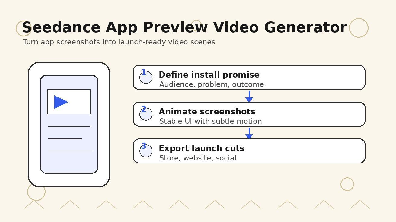
Seedance App Preview Video Generator 2026: Create App Store and Product Launch Clips
Use Seedance to turn app screenshots, feature copy, and launch goals into App Store previews, Google Play promo videos, and product launch clips.
Read article
Gemini AI Video Prompt Examples: Copy-Ready Veo Scenes and a Better Prompt Formula
Copy Gemini AI video prompt examples for cinematic motion, product ads, dialogue, and vertical clips, then adapt them with a practical Veo prompt formula.
Read article
How to Keep Product Shape Consistent in AI Video Ads
Lock product geometry, packaging, labels, references, camera angles, and approval checks so AI video ads preserve the real SKU across every shot.
Read article