How to create cartoon character in 5 simple steps
Before you even think about sketching, you need to get inside your character's head. Every great cartoon creation, whether it's a plucky hero or a grumpy sidekick, starts with a story. This is where you build your character brief—it's the bedrock of your entire design process.
This document is your North Star. It outlines your character's backstory, core personality traits, and what drives them. Getting this right from the beginning ensures every visual choice you make later on is intentional and helps tell their story. It's what makes a character feel real and connect with an audience.
Building Your Character's Foundation
Jumping straight into drawing without understanding who you're drawing is a common mistake. You end up with something that looks cool but feels hollow. Taking the time to think through your character's inner world helps you sidestep tired clichés and create someone genuinely unique. For a fantastic deep dive into this, check out the ultimate guide to character design fundamentals from Studio Liddell.
Think of it as laying down three essential pillars for your character's existence. This infographic really nails how these elements work together.
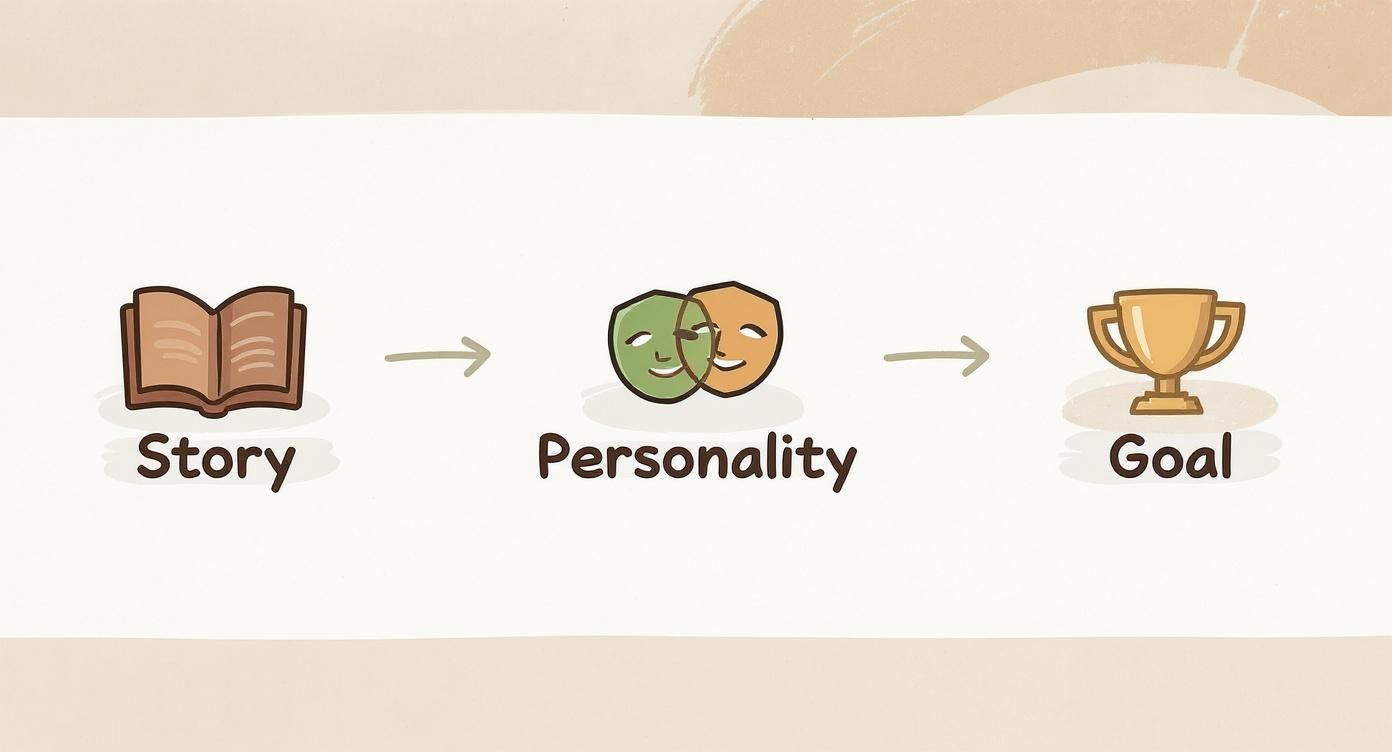
As you can see, it’s a natural flow: their past (Story) shapes who they are now (Personality), which in turn fuels what they want for the future (Goal). Get these three things right, and you've got a character with real depth.
Defining a Compelling Backstory
Characters don't just pop into existence; they're moulded by their past. A backstory gives you the "why" behind their quirks and decisions. It doesn’t have to be a sprawling epic—just a few key moments that defined them will do the trick.
Actionable Insight: Try the "Three Whys" technique. For any trait your character has, ask "why" three times to dig deeper.
- Why is he timid? Because he was teased.
- Why was he teased? Because he preferred cooking over digging.
- Why did he prefer cooking? Because he found joy in creating something delicate in a world that valued brute strength.
Let’s try this with an example. I’ll invent a character called Barnaby. He's a badger, but he's a bit timid and dreams of becoming a world-class chef.
- Barnaby's Backstory: Barnaby grew up in a busy forest warren where all the other badgers were tough, burly diggers. He, however, was always more fascinated by the delicate flavours of wild mushrooms and berries. He was often teased for his gentle nature, so he started practising his cooking in secret.
Just like that, we understand why he might be shy and why his dream means so much to him. It adds immediate context.
Establishing Core Personality Traits
Personality is all about how your character interacts with the world around them. The real magic happens when you get specific and introduce a little contradiction. Pairing a dominant trait with a clashing one creates instant intrigue.
Consider these kinds of dynamic pairings:
- Curious but Cautious
- Boastful yet Insecure
- Loyal but Impulsive
- Optimistic but Naive
Actionable Insight: Don't just list traits; describe how they manifest. Instead of "Loyal but Impulsive," write: "Would drop everything to help a friend in trouble, but often leaps into action without thinking through the consequences."
For our badger chef, let's make him timid yet ambitious. This internal tug-of-war is a goldmine for storytelling. He desperately wants to share his food with the world, but his deep-seated fear of being judged holds him back.
A Quick Tip from Experience: The most memorable characters are a bundle of contradictions. A character who is all good or all bad is boring and predictable. Give them flaws and internal conflicts, and they’ll feel far more human and relatable.
Setting Clear Motivations and Goals
So, what does your character want more than anything? A clear, specific goal is what propels the story forward. This desire needs to be personal and powerful enough to make them face their fears and overcome obstacles.
This focus on a character's inner world isn't new. Think about the rich history of British cartooning. From as early as 1841, magazines like Punch were using caricature to explore personality and motivation, quickly reaching a circulation of 10,000 copies a week. Those artists knew that a character's appearance had to be a direct reflection of who they were inside.
Back to Barnaby, his goal is straightforward but powerful.
- Barnaby's Goal: To win the annual "Forest Feast" cooking competition. This isn't just about cooking; it's about proving to everyone (and himself) that a gentle badger can be the greatest chef in the woods.
Now we have a complete brief. Barnaby isn't just a drawing of a badger in an apron. He's a character with a history, a conflicted personality, and a dream. This solid foundation will now inform every single design decision you make, from the way he stands to the colour of his neckerchief.
Giving Your Character Form Through Sketching
You’ve got the character brief sorted, which is the soul of your creation. Now it's time to give it a body. Sketching is where all those brilliant written ideas—Barnaby's shyness, his secret dream of becoming a chef—start to become something you can actually see. Don't aim for a polished masterpiece right away; this stage is all about playing, exploring, and seeing what works.
The goal here is simple: turn personality traits into a visual language. Every single line, curve, and angle you draw tells a part of the story before a single word of dialogue is written. This is your chance to experiment without any pressure and just let the ideas flow onto the page or screen.
What Story Are Your Shapes Telling?
Before you even think about adding eyes or a little chef's hat, the basic shapes you choose are already doing the heavy lifting. This idea is called shape language, and it's a fundamental tool you need to master to create a cartoon character that an audience connects with instantly.
Just think about basic geometry and the gut feeling each shape gives you:
- Circles and Ovals: These are soft, cuddly, and friendly. With no sharp corners, they feel safe and approachable—perfect for capturing Barnaby's gentle, timid nature. I’d start by giving him a very round body and head to really sell that vibe.
- Squares and Rectangles: These feel solid, stable, and dependable. Think of a character built from squares; they might come across as strong, stubborn, or maybe even a bit rigid and unadventurous.
- Triangles and Sharp Angles: Triangles are full of energy. They can point the way, but they often scream danger, villainy, or cunning. Those sharp points put us on edge, which is why villains so often have sharp, triangular features.
Practical Example: For Barnaby, we're definitely leaning into circles to highlight his harmless personality. But what if we added a few subtle triangles in his chef's hat or the cut of his apron? That could be a great visual hint at his sharp ambition and hidden talent, adding a layer of complexity.
The Power of a Strong Silhouette
Here’s one of the most important tests for any character design: the silhouette test. If you filled your character's entire outline in with solid black, would you still know who it is? An iconic silhouette makes your character distinct and memorable, even from a distance or in a chaotic scene.
Actionable Insight: Set a timer for 30 seconds and sketch a rough outline of your character. Don't add details. Now look at it. Is the pose clear? Is the character's general shape unique? If not, try exaggerating a key feature—like making Barnaby's chef hat ridiculously tall or his ears extra floppy—and sketch again.
When you create a cartoon character, a recognisable silhouette is your secret weapon. It's what makes characters like Mickey Mouse or Homer Simpson instantly identifiable from their outline alone. This clarity is the hallmark of great design.
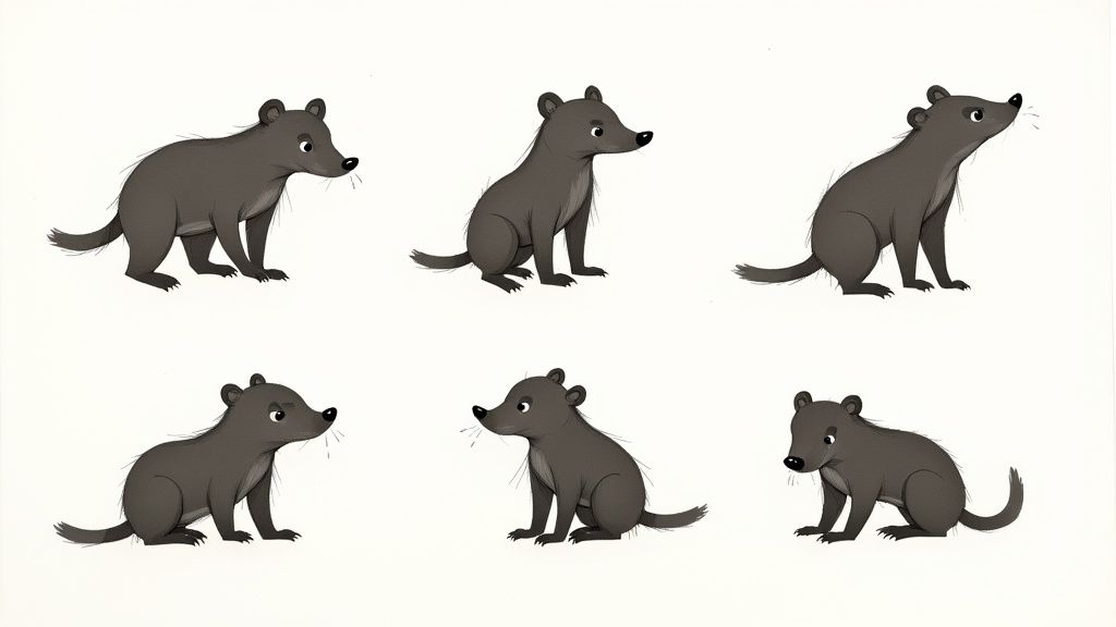
Let's try this with our badger chef, Barnaby. We could explore a few options:
- A short, plump version with a big, round belly (emphasises his gentle, comforting nature).
- A taller, lankier version with long, slightly clumsy limbs (highlights his awkwardness).
- A version with a huge head and a small body (plays up his anxious, thoughtful mind).
Each of these silhouettes tells a slightly different story. The plump one feels more classic and cuddly, reinforcing his timid side. The lanky one might lean more into awkward comedy. By sketching them all out, you start to get a real feel for which shape best captures the personality you wrote down in your brief.
Iterating and Finding Their Expressions
Once you've landed on a silhouette that feels right, it’s time to start iterating. This just means creating multiple versions of the same idea, refining it a little bit more with each pass. It’s a crucial process for zeroing in on the perfect look.
Now, focus on the face and a few key expressions. What does Barnaby look like when he's nervously presenting a new dish? How does his whole face light up when he finally perfects a sauce? Sketch them out.
- Practical Example for "Timid": Draw big, worried eyes, a small, downturned mouth, and maybe eyebrows that curve upwards in the middle. Try drawing his shoulders hunched slightly and his paws held close to his body.
- Practical Example for "Ambitious": Draw a look of intense concentration—furrowed brows and a determined set to his mouth. Perhaps a hopeful, confident smile appears when a recipe turns out just right. Un-hunch his shoulders and give him a more purposeful stance.
By drawing these expressions, you're making sure your design is flexible enough to show a full range of emotions. This is what makes a character feel believable and engaging, and it gives you a solid visual blueprint before moving on to style and colour.
Giving Your Character a Signature Style and Colour Palette
Now that you've got a solid sketch giving your character form, it's time to breathe some life into it with style and colour. This is the stage where you define the whole vibe. Are you going for a clean, modern look, or maybe something with a bit more traditional texture? The choices you make here are huge – they'll completely shape how people connect with your creation.
Every art style carries its own emotional signature. A flat, minimalist design can feel slick and contemporary, while a painterly, storybook approach often brings a sense of nostalgia and warmth. When you set out to create a cartoon character, this decision is just as crucial as the shapes and expressions you've already locked down.
<iframe width="100%" style="aspect-ratio: 16 / 9;" src="https://www.youtube.com/embed/akVAWghc_KE" frameborder="0" allow="autoplay; encrypted-media" allowfullscreen></iframe>
Choosing an Art Style That Fits Your Story
The look you choose should always, always serve the character's personality and the overall tone of your story. Imagine trying to tell a lighthearted children's tale with a gritty, ink-heavy comic book style—it just wouldn't feel right. Likewise, a bubbly, super-cute aesthetic would probably clash with a dark, dramatic narrative.
This is a great chance to dive into the rich history of animation for a bit of inspiration. In the UK, for instance, the roots of animation go way back to the late 19th century. Pioneers like Charles Armstrong and Arthur Melbourne-Cooper were already fiddling with visual storytelling in the early 1900s, long before colour was even in the picture. Their work laid the groundwork for an industry that would go on to produce iconic styles, like in the classic film Animal Farm (1954). If you're curious, you can get a great overview of this history on the British animation Wikipedia page.
To help you get your bearings, let's look at some popular cartoon styles and what they do best.
Comparison of Common Cartoon Styles
Choosing a visual style is about more than just aesthetics; it's about picking the right visual language for your story. This table breaks down some popular options to help you see what might work for you.
| Style Type | Key Characteristics | Best For | Emotional Impact |
|---|---|---|---|
| Modern Flat Design | Clean lines, simple shapes, no gradients or textures, bold colour palettes. | Corporate explainers, mobile apps, sleek modern animations. | Approachable, clean, and efficient. |
| Painterly/Storybook | Visible brush strokes, soft edges, rich textures, and layered colours. | Children's stories, fantasy worlds, projects needing emotional depth. | Whimsical, warm, and nostalgic. |
| Vintage/Rubber Hose | Bouncy, looping limbs without clear joints, simple circle-based designs. | Comedic or retro-themed projects paying homage to early animation. | Playful, energetic, and classic. |
| Anime/Manga | Exaggerated eyes, expressive faces, dynamic action lines, stylistic hair. | Action, drama, and stories with intense emotional character arcs. | Dramatic, expressive, and energetic. |
Practical Example: For our timid badger chef, Barnaby, a painterly storybook style is a perfect fit. It will really amplify his gentle nature and the cosy, woodland setting of his story. If we were creating a villain instead, say a sneaky fox, we might borrow from the Anime/Manga style to get sharp, angular lines that convey cunning and speed.
Building a Purposeful Colour Palette
Colour is easily one of the most powerful tools in your non-verbal communication toolkit. It can set a mood in an instant, hint at a character's personality, and subtly guide the viewer's eye. A carefully selected palette is what makes a design feel intentional and professional.
When you're starting out, think a little about colour psychology. Warm colours like reds and yellows tend to scream energy, passion, or happiness. On the flip side, cool colours like blues and greens can feel calm, sad, or even mysterious. The trick is to be deliberate with every single hue you pick.
I see this mistake all the time: creators use too many colours, and the character ends up looking busy and confusing. A good rule of thumb is to stick to three to four main colours. This creates a strong, memorable palette that doesn't overwhelm the eye.
Let's apply this thinking to Barnaby.
- Primary Colour: He's a badger, so his main colour will be an earthy, muted brown. This immediately grounds him in his natural environment and reflects his humble, down-to-earth personality.
- Secondary Colour: For his belly and snout, we'll go with a soft cream. It provides a gentle contrast and reinforces his soft-spoken nature.
- Accent Colour: Now for the fun part—showing his ambition. A bright, hopeful canary yellow for his chef's apron gives us a fantastic pop of colour. This accent instantly draws attention and symbolises his bright dream of becoming a chef.
See how that simple, three-colour palette tells a story on its own? It speaks volumes about who Barnaby is now (an earthy badger) and who he dreams of becoming (a brilliant chef). Nailing these stylistic details makes your character feel so much more real and sets you up for success when generating them consistently across different scenes. If you're ready to get started, you can learn more about how to transform text into stunning visuals with AI.
Keeping Your Character Consistent with Model Sheets and AI
You’ve got a killer design, a distinct style, and a meaningful colour palette. So far, so good. Now comes the real test: making sure your character actually looks like themselves in every single shot. Consistency is what separates an amateur design from a believable character, and honestly, it’s where a lot of projects fall apart.
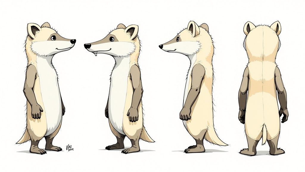
The secret weapon here is an old-school animation tool: the model sheet. You might also hear it called a character turnaround. Think of it as your character’s visual bible. It shows them from the front, side, and back, locking down their proportions and defining features so they stay constant from any angle. It’s a classic technique for a reason—it works.
Turning Your Model Sheet into a Powerful AI Prompt
In today's AI-assisted workflow, that model sheet becomes more than just a reference drawing; it's the blueprint for your master prompt. The trick is to translate every visual detail on your sheet into a descriptive, repeatable command for the AI. This is how you'll get the generator to recreate your character precisely, every single time.
First, break your character down into their non-negotiable parts. Don't just tell the AI "a badger"—be ruthlessly specific. What are the features that make them who they are?
Actionable Insight: Create a checklist of 5-7 "unbreakable rules" for your character. For Barnaby, the list would be:
- Is a male badger.
- Body is plump and round.
- Has a cream-coloured belly/snout.
- Always wears round spectacles.
- Always wears a canary yellow apron.
- Style is painterly/storybook.
- Expression matches the scene's mood.
This list is the DNA of your character, translated into text. It’s the foundation of everything that follows.
Building a Master Prompt That Delivers
Once you have that list, it’s time to assemble your master prompt. How you structure this is incredibly important. A well-organised prompt gives the AI a clear hierarchy of what to prioritise, which means you'll get better, more consistent results.
A formula that works really well is: [Character Identity] + [Key Physical Features] + [Clothing/Accessories] + [Art Style].
Applying this to Barnaby gives us our base prompt:
A full-body character design of Barnaby, a timid male badger, with a plump body and soft cream fur on his belly. He wears round spectacles and a bright canary yellow chef's apron. The image is in a painterly, warm storybook illustration style, with a plain white background.
This prompt is detailed, specific, and ready to be used over and over. That "plain white background" part is a pro tip—it isolates the character, making it a breeze to composite your images into different scenes later on. For a deeper dive into this, it’s worth checking out resources on AI-driven character design with Stable Diffusion.
Nailing Those All-Important Expressions
Characters aren't just static figures; they have feelings. Your model sheet should include a few essential expressions—happy, sad, surprised, determined—and your prompt needs to be able to generate them on command.
The good news is, you don't need to start from scratch. Just adapt your master prompt by adding a simple action or expression descriptor.
- Practical Example (Happy Barnaby): "…Barnaby, a timid male badger, smiling warmly as he holds a wooden spoon…"
- Practical Example (Worried Barnaby): "…Barnaby, a timid male badger, with a worried expression, wringing his paws nervously…"
By tweaking just one part of the prompt while keeping the core description identical, you maintain perfect visual consistency while exploring your character's emotional range. This is also a crucial step if you want to take your still images and bring them to life. If that's your goal, our guide on how to animate a picture will walk you through the next steps.
It's interesting to note that getting character consistency right is a challenge animators face everywhere. The UK has a massive animation industry, contributing over £2.8 billion to the economy and employing more than 4,700 people. But even with homegrown icons like Wallace & Gromit, a 2015 YouGov poll revealed the nation's favourite cartoon was actually the American-made Tom & Jerry, with 19.1% of the vote. It just goes to show how powerful and universally appealing a consistent character can be.
Putting in the effort to create a solid model sheet and a rock-solid prompt template is probably the single most important thing you can do to ensure your character feels real and recognisable from one scene to the next.
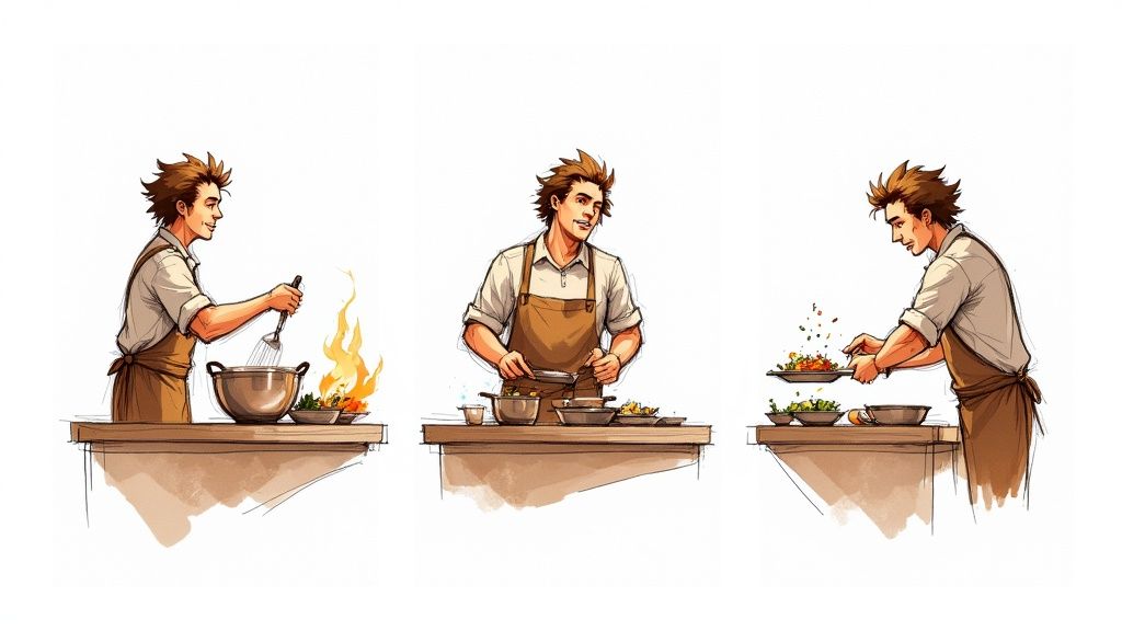
Testing and Refining Your Character for Storytelling
A character design isn’t really finished until it can perform. Think of this as the dress rehearsal—the point where you push your design to its limits to see if it holds up across different storytelling moments. With your master prompt template in hand, it’s time to put your character through its paces.
The real test is generating your character in a whole range of poses, emotional states, and lighting conditions. Does Barnaby look convincing when he’s overjoyed after baking the perfect pie? Is his design still clear and recognisable in a wide shot of the forest as well as an emotional close-up? This is where you’ll spot those subtle inconsistencies that can shatter the illusion of a living, breathing character.
Stress-Testing Your Design Across Scenarios
Consider this process a rigorous quality check. Your aim is to find any weak spots in your visual design or your AI prompt before you commit to building out a full narrative. A character that only looks good in a neutral pose isn't ready for a story.
I find it helps to create a simple shot list designed specifically to test your character’s flexibility. This isn't about telling a story just yet; it's about making sure all the individual parts work properly.
Here’s an actionable checklist you can use for your own projects:
- Emotional Range: Generate your character expressing at least three core emotions (e.g., happiness, sadness, anger). Does the AI consistently render their key features, like Barnaby’s spectacles, during these emotional shifts?
- Dynamic Poses: Prompt your character in action poses that fit their story. For Barnaby, that would be things like "kneading dough," "carrying a stack of books," or "running through the woods." Keep a close eye out for distorted limbs or inconsistent clothing.
- Varying Shot Distances: Create a wide shot, a medium shot, and a close-up. A strong design remains identifiable even as a small figure in the background. That silhouette you perfected earlier? This is where it really proves its worth.
- Lighting Conditions: How does your character look under different lights? Generate them in "bright daylight," "moody evening light," and "by the warm glow of a fireplace." Pay attention to how the colours and shadows behave.
This testing phase is invaluable. Trust me, it’s far easier to tweak a prompt or a small design element now than to fix dozens of inconsistent images down the line.
Identifying and Fixing Inconsistencies
As you generate these test images, you’ll inevitably find small problems. Maybe the AI occasionally forgets Barnaby's apron or changes the shape of his glasses. Don't let it discourage you; this is a completely normal and essential part of the refinement process.
When you spot a recurring issue, the solution is almost always to go back and strengthen your master prompt.
Practical Example of Prompt Refinement
Let’s say the AI sometimes renders Barnaby’s apron blue instead of yellow.
- Original Prompt Snippet:
...a bright yellow chef's apron... - The Problem: The term "bright yellow" might be a bit too generic, giving the AI some wiggle room.
- Refined Prompt Snippet:
...wearing his signature canary-yellow chef's apron with a front pocket...
By adding more specific and unique descriptors like "signature," "canary-yellow," and "front pocket," you give the AI much less room for error. This simple change tightens consistency and makes your character far more reliable. The same logic applies if you're thinking ahead to motion; learning more about making animated photos can give you ideas for how these static tests might eventually translate to movement.
Key Takeaway: Treat your master prompt as a living document. Every test that reveals an inconsistency is an opportunity to make your prompt more robust. Refinement isn't failure; it's the path to a professional result.
Ultimately, this back-and-forth loop of testing and refining is what transforms a good idea into a great, story-ready character. It ensures that when you're finally ready to build your narrative, your character will be a consistent and reliable actor, prepared for any scene you can dream up.
A Few Common Questions
Jumping into character design, especially when mixing classic art techniques with AI, can spark a lot of questions. I get asked these all the time, so I've put together some answers based on what I've learned from my own projects.
How Can I Keep My AI-Generated Character Consistent?
This is the big one, isn't it? Getting an AI to stick to a design across multiple shots can feel like herding cats. The trick is to get incredibly specific with your base prompt and then layer on a couple of clever techniques. If you're vague, the AI will get creative, and not always in a good way.
Actionable Insight: Invent unique, repeatable 'tokens' for your character’s key features. Don't just say "badger with glasses." Give those features a name the AI can latch onto.
- Practical Example: For our friend Barnaby, I might consistently use tokens like
BarnabyBadgerV1,crookedLeftEar, andwornYellowApronin every single prompt. Using these exact phrases time and again tells the AI, "Hey, remember this specific detail," which massively helps with consistency.
Another really effective method is to lean on image-to-image generation. Once you have a master prompt you love, generate a few key reference poses—maybe a neutral stance, a happy look, and a sad one. Then, when you need to create a new scene, you can feed one of these images back to the AI along with your new text prompt. It gives the AI a solid visual starting point and makes a world of difference for reliability.
What If I’m Not a Great Drawer?
This comes up a lot, and honestly, you don't need to be a professional artist to design a compelling character. Not at all. The early sketching part is purely for getting ideas out of your head, not for creating a polished work of art. Think of it as visual brainstorming—you're just playing with simple shapes and silhouettes to see what feels right.
In many ways, your character brief is far more crucial than your drawing ability. A well-defined story and personality will guide you and the AI much more effectively than a perfect sketch.
Actionable Insight: If drawing just isn't your thing, try creating a "mood board" instead. It’s a fantastic alternative. Gather images that capture the vibe, style, colours, and even the textures you're imagining. You can then use the ideas from your board to write super-descriptive text prompts, translating your vision for the AI without ever picking up a pencil.
How Do I Pick the Right Colours for My Character?
Colour choice starts with a bit of basic colour psychology. What's the feeling you're after? Warm colours like reds and yellows tend to scream energy and happiness. Cooler blues and greens can feel much calmer or even a bit melancholic. It all comes back to your character's personality.
With Barnaby the badger, we went with earthy browns to keep him grounded in nature, but that splash of bright yellow on his apron hints at his sunny, optimistic dream. That little bit of contrast tells a story all by itself.
Actionable Insight: Use a free online tool like Adobe Color to explore different colour schemes. Try the "Triad" or "Complementary" options to instantly find colours that work well together. For Barnaby, plugging in his earthy brown would likely suggest blues and oranges, which could be great for secondary characters or backgrounds.
To keep your design from looking too busy, try to stick to a main palette of just three or four key colours. This not only creates a stronger, more memorable look but also makes it much easier for both your audience and the AI to recognise the character instantly.
Ready to take these ideas and create your own cast of characters? Seedance is built to help you turn those detailed prompts into amazing, consistent multi-shot stories. Give it a go and watch your vision come to life at https://www.seedance.tv.