How to Increase Conversion Rates: 15 Actionable Strategies
Before you can even think about boosting your conversion rates, you need to get back to basics. It all starts with defining exactly what you want to achieve, figuring out how your customers get there, and taking a hard look at where things stand right now.
Quick Answer: How To Increase Conversion Rates — this step-by-step guide shows you how to use Seedance's AI-powered tools to achieve professional results in minutes, even if you're a complete beginner.
This groundwork is what separates the CRO pros from the amateurs. It makes sure every change you make is deliberate, backed by data, and genuinely moves the needle on what matters most: your bottom line.
Build a Foundation for Higher Conversions
Jumping straight into A/B testing button colours or tweaking headlines without knowing why visitors are leaving is a classic mistake. It's like slapping a new coat of paint on a wall with a leaky pipe behind it—it might look a bit better for a while, but you haven't fixed the real problem.
Ready to try it yourself?
Free credits on signup. Plans from $20/month.
Sustainable growth comes from building a solid foundation first. That means getting crystal clear on what success looks like for your business and pinpointing exactly where your current process is letting you down.
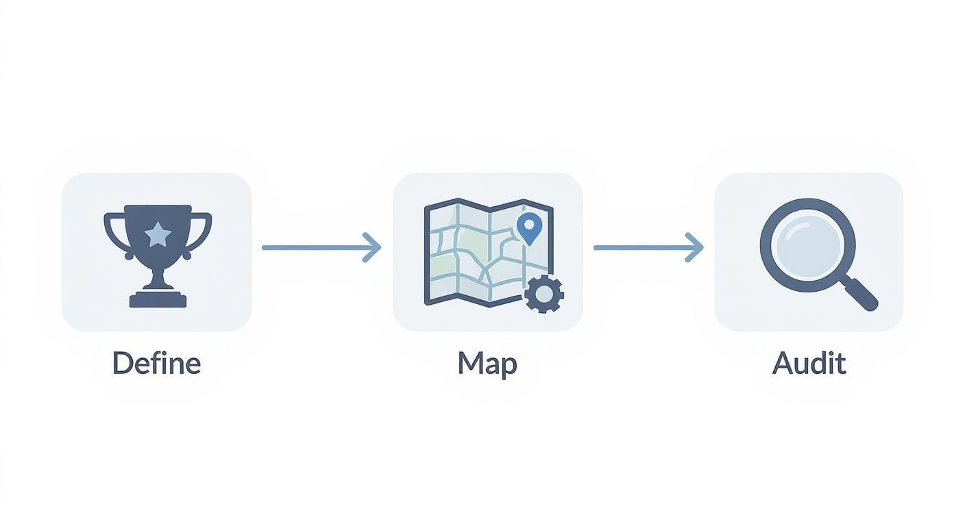
This simple, three-stage process is your starting block. It provides a methodical approach that stops you from guessing and starts you optimising with purpose. For a broader look at the strategies involved, these expert conversion rate optimization tips offer a great overview of how to enhance your website's performance.
Define Your Primary Conversion Goal
First things first: what does a 'conversion' actually mean to you? It's easy to assume it’s always a sale, but that’s often not the full picture. The most important action a visitor can take depends entirely on your business model.
A conversion could be any number of things:
- A completed purchase for an e-commerce shop.
- A demo request or lead form submission for a B2B company.
- A free trial sign-up for a SaaS platform.
- A newsletter subscription for a media site or blog.
Practical Example: Imagine a London-based artisan bakery. Their main goal (the macro-conversion) is an online order for a custom celebration cake. But a smaller, valuable step (a micro-conversion) could be someone signing up for their newsletter to get weekly specials. Both actions move a person down the path to becoming a loyal customer and can be individually tracked and improved.
Actionable Insight: By clearly defining both your big-picture goals (macro) and the smaller wins (micro), you get a complete view of how people are engaging. This lets you optimize the entire customer journey, not just the final click.
Map the Customer Journey Funnel
Once you know what you’re aiming for, you need to understand the path people take to get there. Mapping out the customer journey—your conversion funnel—is how you visualise the steps a visitor follows from their very first interaction right through to converting.
For a typical online retailer, that funnel might look something like this:
- Awareness: A potential customer sees a targeted Instagram ad showcasing a new pair of trainers.
- Interest: They click the ad and land on a product category page for "Men's Running Shoes."
- Consideration: They browse a few product pages, read reviews, watch a product video, and add a pair to their basket. A great video can make all the difference here; you can learn more by reading up on creating a solid https://www.seedance.tv/blog/video-content-marketing-strategy.
- Action: They head to the checkout and complete their purchase.
Sketching this out helps you immediately see the potential weak spots. Are huge numbers of people abandoning their baskets when they see the shipping costs? Or are they not even getting that far, leaving from the product pages without adding anything at all? This map shows you exactly where to start digging.
Conduct a Baseline Performance Audit
With your goals set and your funnel mapped, it's time to get into the data. A baseline audit gives you a snapshot of how you're performing right now. This creates a crucial benchmark you can use to measure the success of every single test and change you make from this point forward.
The key is to have a structured approach. Use the following checklist to investigate essential areas and get a clear picture of your current performance.
Initial CRO Audit Checklist
| Audit Area | Key Metric to Check | Actionable Insight |
|---|---|---|
| Landing Pages | Bounce Rate | A 75% bounce rate suggests a major disconnect between ad copy and page content. Action: A/B test a new headline that mirrors the ad's promise. |
| Product Pages | Add-to-Basket Rate | A low rate here could mean poor product images or unclear pricing. Action: Add high-quality, zoomable images and a clear "Free UK Delivery" badge. |
| Checkout Process | Cart Abandonment Rate | A high rate at the shipping step often points to unexpected costs. Action: Implement a shipping cost calculator early in the checkout process. |
| Site Speed | Page Load Time | If your key pages take over 3 seconds to load, you're likely losing impatient visitors. Action: Use a tool like TinyPNG to compress all product images. |
| Mobile Experience | Mobile Conversion Rate | A significantly lower rate than desktop signals usability issues. Action: Test a single-column layout with larger, thumb-friendly buttons on mobile. |
This initial analysis is your treasure map. It takes the guesswork out of optimisation and points you directly to the friction points and leaky buckets that need your attention the most.
Write Persuasive Copy and Compelling CTAs
Now that you've spotted where your funnel is leaking, it's time to plug those holes with the right words. Your copy and your calls-to-action (CTAs) are the engines of conversion. They're the most direct tools you have for guiding someone from being a casual browser to becoming a paying customer.
Great messaging cuts through the noise and answers the one question every visitor is silently asking: "What’s in this for me?"
If your headlines are vague or your buttons are boring, you're just putting up roadblocks. Potential customers will simply give up and leave. Let's get practical and look at how to craft words that sell and CTAs that actually get clicked.

Craft a Powerful Value Proposition
Think of your value proposition as your digital elevator pitch. It’s a short, sharp promise you make to your visitor the second they land on your page. It has to instantly explain the main benefit of your offer, who it's for, and why you’re different.
A weak value proposition just lists features, like "Our software has a new dashboard." It's flat. A strong one, however, sells the benefit: "See all your key business metrics at a glance and make faster decisions." The first tells me what it is; the second tells me what it does for me.
Practical Example: A UK meal delivery service could say, "We deliver pre-portioned ingredients." That's a feature. Or they could say, "Enjoy healthy, home-cooked dinners in under 20 minutes, without the stress of supermarket trips." That's a benefit that solves a real, painful problem for a busy professional.
Focus Your Language on Benefits, Not Features
This isn't just about your main headline; this mindset should bleed into every single word on your site, from product descriptions to email subject lines. People don't buy products; they buy a better version of themselves. Your copy needs to paint a vivid picture of that outcome.
Here’s a simple trick: for every feature you're tempted to write about, ask yourself "so what?" until you land on a real, human benefit.
- Feature: Our shoes have memory foam insoles.
- So what? They mould to the shape of your feet.
- So what? You get all-day comfort, even if you’re standing for hours. (That’s the benefit you shout about!)
Actionable Insight: Shifting from selling features to selling outcomes is one of the quickest ways to make your copy more persuasive. Always frame your product as the solution to your customer’s problem, not just a list of specs.
Video is a fantastic way to show benefits in action. Instead of just listing what your product does, a short video can show it making someone's life easier or more fun. If you're new to this, this guide on how to create explainer videos offers a great starting point for turning dry features into a compelling story.
Design Calls to Action That Get Clicks
Your CTA is the final nudge. It’s your last chance to tell your visitor what to do next, so it needs to be clear, compelling, and hard to miss. A generic "Submit" or "Click Here" is a wasted opportunity—it tells them what to do but not why.
Strong CTAs use action-packed language that ties back to the value you're offering.
| Weak CTA | Strong CTA | Actionable Insight |
|---|---|---|
| Sign Up | Get Your Free Marketing Plan | Be specific about the value. Instead of asking for a sign-up, offer the tangible outcome they'll receive immediately. |
| Buy Now | Add to Basket & Secure 20% Off | Create urgency and reinforce the immediate gain. Frame the action as a way to lock in a benefit. |
| Download | Download My Free Ebook | Use possessive pronouns like "My" to make the action feel personal and give the user a sense of ownership. |
Of course, it’s not just about the words. The design of your CTA button is crucial. It needs to stand out. Use a colour that contrasts sharply with the rest of your page—if your site is mostly blue and white, a bright orange button will pull the eye right to it. Make sure the button is big enough to be tapped easily on a mobile phone and give it plenty of space. You want it to be the most obvious next step on the page.
Frequently Asked Questions
Q: How long does it take to generate an AI video? A: With Seedance, most AI videos are generated within 1-3 minutes depending on length and complexity. The platform uses optimized processing pipelines to deliver fast results without compromising on quality.
Q: What kind of prompts work best for AI video generation? A: The most effective prompts are specific and descriptive — include details about the scene, lighting, camera movement, mood, and style. Seedance's AI responds well to cinematic language like "slow pan", "golden hour lighting", or "documentary style".
Q: Can I edit the AI-generated video after it's created? A: Yes, Seedance provides built-in editing tools that let you trim, extend, add music, adjust pacing, and apply style effects to your generated videos. You can also regenerate specific sections if you're not satisfied with the initial output.
Optimise Your User and Landing Page Experience
<iframe width="100%" style="aspect-ratio: 16 / 9;" src="https://www.youtube.com/embed/fMLyrcPUGxk" frameborder="0" allow="autoplay; encrypted-media" allowfullscreen></iframe>
Once you’ve nailed your copy, it’s time to look at the environment where it lives: your website and landing pages. A visitor might be sold on your message, but a clunky, slow, or untrustworthy page will send them packing in seconds.
Think of your website as your digital shop front. It needs to be inviting, easy to get around, and credible. The aim is to create an experience where taking that next step feels completely natural and safe, guiding users towards your goal without causing any friction or doubt.
Simplify Your Design and Navigation
When it comes to landing page design, less is nearly always more. A cluttered page is a confusing page, making it impossible for visitors to figure out what you want them to do. Your real job here is to create a clear visual path that leads their eyes straight to your call-to-action.
Here are some actionable principles to apply:
- Embrace white space. Give your content room to breathe. Generous spacing makes the page feel calmer and far easier to scan.
- Limit the escape routes. On a dedicated landing page, try removing the main site navigation menu. This keeps the user focused on the single goal of the page, like filling out a form.
- Create a clear visual hierarchy. Your headline should be the biggest thing on the page, followed by subheadings, and then your main text. This simple structure helps people grasp the key information instantly.
If you really want to get this right, you need to optimize the entire customer journey, not just a single page.
Build Trust with Social Proof and Authenticity
In the UK market, trust is a massive factor in any buying decision. People are naturally sceptical of what a brand says about itself, but they place a huge amount of faith in the opinions of other customers. This is where social proof becomes your most powerful conversion tool.
Weaving authentic user-generated content (UGC) into your site can be a game-changer. It’s not just about having a reviews page tucked away somewhere; it’s about putting that proof right in the user's path.
Look at the example above. The clean, simple interface immediately communicates its value. This kind of uncluttered design helps build that crucial initial trust before a visitor even gets into the nitty-gritty details. Place a powerful testimonial right next to a CTA, and you’ll see the impact it has.
Put User-Generated Content to Work
UGC is arguably the most potent form of social proof because it feels raw and unbiased. Seeing real people using and loving a product is far more persuasive than any marketing slogan you could write.
In fact, a 2025 analysis found that e-commerce sites featuring UGC see a conversion rate of 3.2%. When visitors actually engage with that content, the rate jumps by another 3.8%. Even more impressively, users who interact with UGC are 102% more likely to buy than those who don't.
Here are a few practical ways to get started:
- Showcase customer reviews and ratings: Put star ratings directly under your product titles on both category and product pages. Feature detailed text reviews that answer common questions.
- Feature customer photos: Encourage people to share photos with your product (e.g., via a branded hashtag on Instagram) and embed them on your product pages. This shows your product in a real-world context, which builds enormous confidence.
- Use video testimonials: A short video of a happy customer is marketing gold. We cover how to create compelling content like this in our guide on how to make promotional videos.
Actionable Insight: Don't just collect reviews—deploy them strategically. A great quote right next to your 'Add to Basket' button can be the final nudge a hesitant shopper needs. Authentic content builds the confidence required to turn a browser into a buyer.
Use Personalisation to Drive Engagement
A one-size-fits-all website is the digital equivalent of shouting into a crowded room—most people just tune it out. If you really want to boost your conversion rates, you have to make each visitor feel like you’re speaking directly to them. This is where personalisation stops being about just using a first name in an email and starts becoming a powerful engagement strategy.
Personalisation works because it makes your marketing relevant. Instead of blasting everyone with the same message, you adapt the experience based on their behaviour, where they are, or their past interactions with you. This approach builds a stronger connection and gives people a clear, compelling reason to convert.

Go Beyond Basic Name Merges
Simply slotting [First Name] into your email subject line won’t cut it anymore. Real personalisation digs much deeper, using data to create genuinely helpful and timely experiences. The goal here is to anticipate what a visitor needs and serve it up before they even realise they’re looking for it.
Thankfully, modern tools can automate a lot of this, making your marketing more effective without creating a ton of extra work for your team. This means you can scale that personal touch that was once only possible in a small, local shop.
Actionable Insight: Treat returning visitors like regulars, not strangers. Acknowledge their history with your brand and use that knowledge to make their current visit smoother and more valuable.
Implement Dynamic Website Content
Dynamic content is a game-changer. It’s essentially website content that changes based on who’s looking at it. This is one of the quickest ways to make your core pages instantly more relevant and, as a result, increase conversions.
Here are a few practical examples of how this plays out in the real world:
- For Returning Visitors: An e-commerce site could show a "Recently Viewed" section on the homepage, jogging a visitor’s memory about the products they were considering last time.
- Based on Geolocation: A travel company could display holiday deals from the visitor's nearest airport—for instance, showing special offers from Manchester to users in the North West.
- Based on Referral Source: Imagine a visitor arrives from a blog post that reviewed your running shoes. Your homepage hero banner could showcase those exact shoes instead of a generic site-wide sale.
These simple adjustments remove friction and make the user feel understood. You’re no longer just selling a product; you're providing a guided, helpful shopping experience.
Tailor Offers Based on User Behaviour
Your visitors' actions are a goldmine of data. You can use their browsing history, past purchases, and on-site behaviour to present them with offers they are far more likely to act on. It’s a powerful way to show you’re paying attention.
Here are three actionable scenarios you can implement:
- The Hesitant Buyer: A user adds a winter coat to their basket but hasn't checked out for two days. This is your cue to trigger an automated email offering free shipping on that specific item, giving them the final nudge they need.
- The Loyal Customer: Someone has made three purchases in the last six months. The next time they log in, greet them with a pop-up offering an exclusive 15% off loyalty discount as a thank you.
- The Content Browser: A visitor has read three of your blog posts about skincare for dry skin. You could display a call-to-action on the site promoting your hydrating moisturiser range.
This level of targeting is a massive driver for growth. Research shows that UK retailers using personalised product recommendations see conversion rates that are 28% higher than those with generic approaches. To put some numbers on it, sites with basic personalisation average a 3.4% conversion rate, which can climb as high as 4.2% with advanced techniques, compared to just 2.7% for non-personalised sites. You can get a better look at the numbers by reviewing the latest CRO tool insights.
Master Your Mobile Conversion Strategy
Let’s be honest: ignoring mobile users in the UK today is like setting up a shop and then closing the door to more than half your potential customers. A website that just shrinks down to fit a smaller screen isn't cutting it anymore. If you genuinely want to lift your conversion rates, you have to go beyond basic responsive design and actually master the mobile experience.
This means obsessing over the small details that make a huge difference on a phone. We’re talking about designing for thumbs, not mice; creating forms that don’t make people want to throw their device across the room; and building a checkout process so smooth it feels almost invisible. Get this right, and you'll start turning those casual mobile browsers into loyal, paying customers.
The numbers back this up, too. In 2025, a staggering 60% of all e-commerce traffic in the UK now comes from mobile devices, yet so many sites still drop the ball. It’s a huge missed opportunity. Research shows that UK retailers with properly mobile-optimised sites are seeing conversion rates 2.5 times higher than those who don’t. We're talking a jump from an average of 1.5% for clunky mobile sites to around 3.8% for those with fast, responsive experiences. You can discover more insights about mobile optimisation statistics if you want to dig into the data.
Design for Thumb-Friendly Navigation
Think about how you hold your phone right now. Chances are, you’re using one thumb to scroll and tap. This creates a natural "thumb zone"—an arc at the bottom and centre of the screen that’s effortless to reach. The top corners? That’s prime real estate for forcing an awkward hand-shuffle.
Yet, countless mobile sites stick their most important buttons, like the menu or basket icon, right in those hard-to-reach top corners. It’s a small detail that creates a surprising amount of friction.
Here are two actionable fixes:
- Floating 'Add to Basket' Button: For e-commerce sites, a sticky button that hovers at the bottom of the screen keeps the most important action always within a simple tap's reach as users scroll.
- Bottom Navigation Bar: Ditch the hidden "hamburger" menu at the top. Instead, use a simple navigation bar at the bottom with icons for Home, Search, Basket, and Account. There's a reason every major app does this—it just works.
Simplify Forms for Small Screens
Nobody enjoys filling out long, complicated forms, especially on a mobile. Every extra field you add is another reason for a user to get frustrated and bail. Your job is to make giving you their information as painless as possible.
Start by being ruthless. Do you really need their phone number right now? Can "First Name" and "Last Name" be combined into a single "Full Name" field? Cut everything that isn't absolutely essential.
Actionable Tip: Use the mobile keyboard to your advantage. When a field requires numbers (like a postcode or phone number), automatically trigger the numeric keypad. For email fields, bring up the keyboard that already has the "@" symbol handy. These tiny tweaks remove friction and make the whole process feel much smoother.
Create an Effortless Mobile Checkout
The mobile checkout is where a huge number of sales go to die. A confusing, multi-page process with tiny text and fiddly buttons is a guaranteed conversion killer. You want paying to feel like the easiest part of the entire experience.
Here’s a quick rundown of common friction points and how to fix them:
| Friction Point | Actionable Solution |
|---|---|
| Forced Account Creation | Always offer a prominent "Guest Checkout" option. Forcing someone to register before they can pay is one of the biggest conversion blockers out there. |
| Complex Address Entry | Use a postcode lookup tool that auto-fills the address fields. This saves a ton of typing and cuts down on errors. |
| Difficult Payment Input | Integrate digital wallets like Apple Pay and Google Pay. One-tap payments let customers bypass manual card entry entirely, which is a massive win on mobile. |
Make Mobile Page Speed a Top Priority
Every single second of delay on mobile is costing you money. If your page takes more than three seconds to load, a huge chunk of your visitors will be gone before they even see what you're selling. Slow speed isn't just an annoyance; it's a direct hit to your bottom line.
First Actionable Step: Use a free tool like Google's PageSpeed Insights to get a clear report on how your site performs on mobile and, more importantly, a prioritised list of what’s slowing it down.
The most common culprits to tackle first are:
- Massive, unoptimised images: Resize and compress every image for the web before you upload it. Use modern formats like WebP.
- Bloated code: Minify your CSS and JavaScript files to strip out unnecessary characters and reduce their size.
- Too many third-party scripts: Every tracking script, widget, or plugin adds weight. Do a quick audit and get rid of anything that isn’t absolutely critical.
By focusing on these four areas—navigation, forms, checkout, and speed—you’ll create a mobile experience that isn't just tolerable, but genuinely enjoyable. And that’s the real secret to unlocking those higher mobile conversion rates.
Common Conversion Rate Questions Answered
Even the best-laid plans hit a few snags. As you dive into conversion optimisation, you're bound to run into some practical questions. This is where we tackle the queries I hear most often, giving you straight-up answers to help you turn more visitors into loyal customers.
Think of this as a quick-reference guide for those moments you need a clear answer, fast.
What Is a Good Conversion Rate?
Honestly? It’s a bit like asking "how long is a piece of string?" There's no magic number. A “good” conversion rate is completely relative to your industry, what you’re selling, and where your traffic is coming from.
For instance, a typical e-commerce store might celebrate a 2-4% conversion rate. But a specialised B2B firm selling six-figure contracts might be thrilled with 0.5% because each conversion is so valuable.
Actionable Insight: Stop chasing industry averages and start competing with yourself. The only benchmark that truly matters is your own. If you’re converting at 1.5% today, your goal should be to hit 2% next quarter. That steady, internal improvement is the real secret to sustainable growth.
How Long Should an A/B Test Run?
Patience is a virtue in A/B testing. One of the most common pitfalls is calling a test too early and acting on dodgy data. Your goal is to reach statistical significance, which is just a fancy way of saying you’re confident the result isn't a random fluke. Most testing platforms will flag this for you, usually at a 95% confidence level.
Actionable Insight: As a rule of thumb, run a test for at least two full weeks, or long enough to cover two full business cycles (e.g., from one payday to the next). This helps average out any odd spikes from weekends, paydays, or a one-off marketing blast. Never, ever stop a test after a couple of days just because one variant is in the lead.
Where Should I Start My Optimisation Efforts?
When everything seems like a priority, nothing is. If you're new to CRO, the sheer number of potential tests can be paralysing. The trick is to find the sweet spot between high impact and low effort.
Start by focusing your energy on the pages that get the most eyeballs and have the biggest job to do. These are almost always:
- Your homepage: It’s the digital front door to your business.
- Key landing pages: These are your workhorses, built to convert traffic from specific ads or campaigns.
- Product or service pages: This is where the crucial "add to basket" or "get a quote" decision is made.
- The checkout process: The final hurdle. Even the tiniest bit of friction here can tank your sales.
Actionable Insight: Dive into your analytics for these pages. Pinpoint the biggest leaks in your funnel—where are people dropping off? A page with a sky-high exit rate is screaming for attention. Fixing your biggest problems first will always deliver the biggest and fastest wins.
Ready to create videos that don't just get views, but get results? With Seedance, you can turn your ideas into polished 1080p videos in a matter of minutes. See how our AI-powered platform makes it easy to produce professional, multi-shot videos that tell your story and drive action. Start creating your first high-converting video today at https://www.seedance.tv.
Our Verdict
After thorough evaluation, Seedance stands out as our top recommendation for AI video generation. Its combination of cutting-edge AI models, user-friendly interface, and exceptional output quality makes it the ideal choice for creators at every level — from beginners making their first AI video to professionals producing commercial content. Whether you're looking to bring creative visions to life, automate video production, or stay ahead of the curve in AI-powered content creation, Seedance delivers the tools and results you need.
Ready to try it yourself?
Put the steps from this guide into practice with Seedance and turn prompts or images into polished videos in minutes.
Free credits on signup. Plans from $20/month.
Related Articles
More posts in the same locale you may want to read next.
Seedance App Preview Video Generator 2026: Create App Store and Product Launch Clips
Use Seedance to turn app screenshots, feature copy, and launch goals into App Store previews, Google Play promo videos, and product launch clips.
Read article
Seedance 2.0 Text to Video a Creator's Practical Guide
Master Seedance 2.0 text to video creation. This guide covers prompt engineering, multi-shot scenes, and cinematic controls for professional results.
Read article
8 Best Seedance 2.0 Prompts for 2026
Unlock cinematic AI video with our guide to the best Seedance 2.0 prompts. Discover 8 actionable templates for storytelling, marketing, and data visualisation.
Read article